|
The following tutorial covers the basics of learning PhotoShop in relation
to "CGing" Or comic book and anime style colouring. There's
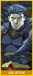
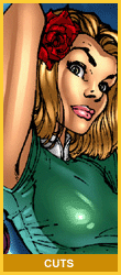
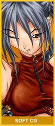
more than just one style of colouring. Examples can be seen to the right
on this page. Keep in mind what you want to achieve. If you're already
familiar with PhotoShop, then this might not be as helpful, but you might
still pick up a few tips :)
For this tutorial I'm using PhotoShop 6 on a PC, but most tools are the
same as earlier/ later versions of the program.
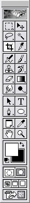 <---
This is the standard Tool Bar. You've probably already tried to click
the buttons. Well, it's just a picture and nothing'll happen, but
it'll aid explanation. Ok, so you want to CG, colour your line artwork
or line art and have just discovered PhotoShop is the thing to do
it. The package is used in all sorts of illustration and graphic design
fields, and most importantly, industry standard comic books! <---
This is the standard Tool Bar. You've probably already tried to click
the buttons. Well, it's just a picture and nothing'll happen, but
it'll aid explanation. Ok, so you want to CG, colour your line artwork
or line art and have just discovered PhotoShop is the thing to do
it. The package is used in all sorts of illustration and graphic design
fields, and most importantly, industry standard comic books!
The
tool bar is very similar to Microsoft's 'Paint', so I'm sure you're
familiar with the layout and interface. First I'd recommend checking
out the "Tool Bar overview" in the PhotoShop help (F1).
Some of the icons contained on the bar are very important, others,
not so important but most are used for a CG, so here's what they do
(starting with the top then working down to the bottom):
 Marquee tools (M): I use these for what I call "post production".
When the CG is all finished, I'll add extra shapes (details) to backgrounds
and foregrounds or for creating a boarder. In PS6, there's a tool
optional bar at the top, which give you extra, well.. Options! Tip:
To create an outline from your selection -Edit -Stroke (or
right click, stroke) and chose the line width. The colour of the line
will be the same as the primary colour selection. Also I'll use it
to select individual frames (on a sequential page)
Marquee tools (M): I use these for what I call "post production".
When the CG is all finished, I'll add extra shapes (details) to backgrounds
and foregrounds or for creating a boarder. In PS6, there's a tool
optional bar at the top, which give you extra, well.. Options! Tip:
To create an outline from your selection -Edit -Stroke (or
right click, stroke) and chose the line width. The colour of the line
will be the same as the primary colour selection. Also I'll use it
to select individual frames (on a sequential page)
 Move tool (V): Moves selections, layers and painted areas. Useful
if you're copy and pasting onto a CG.
Move tool (V): Moves selections, layers and painted areas. Useful
if you're copy and pasting onto a CG.
 Lasso tools (L): Like the marquee tool, but you have more control
over the selections you make. This tool is used a lot for "Cuts"
and "Cel style" solid tones (More about them later)- see
the examples below. The Magnetic tool is rarely used. If you don't
have a Graphics Tablet, you'll spend more time with the Polygon tool,
since the Freehand tool can be tricky to use with a mouse. This is
one of the 3 possible tools I'll choose to use for laying my initial
base tone. After you've made your selection, fill it with colour.
I often make amendments to my selections, so if you've made a mistake,
instead of starting a new selection, hold down SHIFT to add extra
selection to your 1st selection- it's very handy. Use ALT instead
to TAKE AWAY from your selection! You'll notice the - and + as you
hold down the keys.
Lasso tools (L): Like the marquee tool, but you have more control
over the selections you make. This tool is used a lot for "Cuts"
and "Cel style" solid tones (More about them later)- see
the examples below. The Magnetic tool is rarely used. If you don't
have a Graphics Tablet, you'll spend more time with the Polygon tool,
since the Freehand tool can be tricky to use with a mouse. This is
one of the 3 possible tools I'll choose to use for laying my initial
base tone. After you've made your selection, fill it with colour.
I often make amendments to my selections, so if you've made a mistake,
instead of starting a new selection, hold down SHIFT to add extra
selection to your 1st selection- it's very handy. Use ALT instead
to TAKE AWAY from your selection! You'll notice the - and + as you
hold down the keys.
  Magic wand tool (W): Don't be fooled by the name! It wont do your
CG for you!! Mostly used if I have some really clean, inked lines
to work with for laying flats. Select an area in your drawing with
the tool, then -Select -Modify -Expand Expanding the selection
will avoid a filled flat from looking as though it's all scummy around
the edges. At the resolution I work at, I'll usually expand an extra
4-6 pixels without my selection going over the lines. Very thin lines
might not work with this method, plus you might need to SHIFT add
with the other selection tools to reach areas that the wand can get
to. Sounds like a tooth brush commercial, I know.
Magic wand tool (W): Don't be fooled by the name! It wont do your
CG for you!! Mostly used if I have some really clean, inked lines
to work with for laying flats. Select an area in your drawing with
the tool, then -Select -Modify -Expand Expanding the selection
will avoid a filled flat from looking as though it's all scummy around
the edges. At the resolution I work at, I'll usually expand an extra
4-6 pixels without my selection going over the lines. Very thin lines
might not work with this method, plus you might need to SHIFT add
with the other selection tools to reach areas that the wand can get
to. Sounds like a tooth brush commercial, I know.
 Crop tool (C): Only used at the very end to trim your finished
art, or if your scan needed clipping back.
Crop tool (C): Only used at the very end to trim your finished
art, or if your scan needed clipping back.
 Slice tool (K): Not used for CGing. It's a tool used when making
graphics for the web.
Slice tool (K): Not used for CGing. It's a tool used when making
graphics for the web.
 Airbrush tool (J): I use it A LOT. After I've laid down my flat
tones, I use this to render those tones. The best bit of advice I
can give for this tool is set the tool options to a low pressure.
Something between 5-10% avoid excess flow of paint and possibly a
muddy looking rendered tone. Taking your time and using subtle shades
will bring home a better result.
Airbrush tool (J): I use it A LOT. After I've laid down my flat
tones, I use this to render those tones. The best bit of advice I
can give for this tool is set the tool options to a low pressure.
Something between 5-10% avoid excess flow of paint and possibly a
muddy looking rendered tone. Taking your time and using subtle shades
will bring home a better result.
 Paintbrush tool (B): It's used a lot for Cel style in conjunction
with the polygon lasso tool. It's also another method for laying down
flats. When I do use this tool I set the hardness to 100 and spacing
to 1 for solid, cleaner brush strokes.
Paintbrush tool (B): It's used a lot for Cel style in conjunction
with the polygon lasso tool. It's also another method for laying down
flats. When I do use this tool I set the hardness to 100 and spacing
to 1 for solid, cleaner brush strokes.
 Pencil tool (B): (With same icon as paint brush). Only really
used a size 999 to quickly re apply a flat tone on a locked layer
if I've made a mistake and want to start again.
Pencil tool (B): (With same icon as paint brush). Only really
used a size 999 to quickly re apply a flat tone on a locked layer
if I've made a mistake and want to start again.
  Clone stamp tool (S): Occasionally used for patterns, but more
commonly used for photo retouching.
Clone stamp tool (S): Occasionally used for patterns, but more
commonly used for photo retouching.
 History brush tool (Y): This brush and I don't have much history
between us- rarely use it.
History brush tool (Y): This brush and I don't have much history
between us- rarely use it.
 Eraser tool (E): I use this one a fair bit. A good tip is to use
it on a locked layer tone so that the secondary colour selection is
used. It saves time swapping and picking a 2nd colour because I have
my tablet pen button (not end) set to eraser.
Eraser tool (E): I use this one a fair bit. A good tip is to use
it on a locked layer tone so that the secondary colour selection is
used. It saves time swapping and picking a 2nd colour because I have
my tablet pen button (not end) set to eraser.
 Gradient tools (G): DON'T try to rely on these instead of an airbrush.
The only thing I'd use them for is part of a background. But not just
a gradient background. Not for single character pinup type works at
least. Generally these are what slackers use that think they're CGing!
Gradient tools (G): DON'T try to rely on these instead of an airbrush.
The only thing I'd use them for is part of a background. But not just
a gradient background. Not for single character pinup type works at
least. Generally these are what slackers use that think they're CGing!
 Paint bucket tool (G): (With same icon as gradient). Used for
filling selections in with flat tones, nothing else.
Paint bucket tool (G): (With same icon as gradient). Used for
filling selections in with flat tones, nothing else.
 Blur tool (R): Occasionally used to help bend colours and to get
rid of 'seems'.
Blur tool (R): Occasionally used to help bend colours and to get
rid of 'seems'.
 Sharpen tool (R): (With same icon as blur) Hardly ever used
 Smudge tool (R): (With same icon as blur) Used a more often than
the blur tool and takes a lot of memory to use. Some times you'll
need a really high spec PC the use a large smudge brush, and even
then it'll take 5 minutes to apply the change! It's been used effectively
on the hair of the Soft CG example below.
Smudge tool (R): (With same icon as blur) Used a more often than
the blur tool and takes a lot of memory to use. Some times you'll
need a really high spec PC the use a large smudge brush, and even
then it'll take 5 minutes to apply the change! It's been used effectively
on the hair of the Soft CG example below.
  Dodge tool (O): I've seen people achieve excellent, more realistic
looking results with this tool, but it's difficult to handle and achieve
a more subtle gradiented type tone. I'd recommend using it on 50%
pressure or less and apply to Mid-tones.
Dodge tool (O): I've seen people achieve excellent, more realistic
looking results with this tool, but it's difficult to handle and achieve
a more subtle gradiented type tone. I'd recommend using it on 50%
pressure or less and apply to Mid-tones.
 Burn tool (O): (With same icon as dodge) The opposite to Dodge,
but used less. I'd rather start with a dark tone, then get lighter
with dodge, than start with a middle tone and use both dodge and burn.
Burn tool (O): (With same icon as dodge) The opposite to Dodge,
but used less. I'd rather start with a dark tone, then get lighter
with dodge, than start with a middle tone and use both dodge and burn.
 Sponge tool (O): (With same icon as dodge) Alters the amount of
'pigment' on a rendered tone. I've never really needed it.
Sponge tool (O): (With same icon as dodge) Alters the amount of
'pigment' on a rendered tone. I've never really needed it.
 Path selection tools (A): Never used it, since I don't use paths
very often.
Path selection tools (A): Never used it, since I don't use paths
very often.
 Type tool (T): Add text! Usually just for post production or details
on a character/building.
Type tool (T): Add text! Usually just for post production or details
on a character/building.
 Pen tools (P): Similar to the polygon lasso (dot-to-dot style
selection), but you have a lot more control over it. I tend to stick
with the lasso tools.
Pen tools (P): Similar to the polygon lasso (dot-to-dot style
selection), but you have a lot more control over it. I tend to stick
with the lasso tools.
 Custom shape tool (U): Most important is the line tool, which
draws straight lines. Not used much.
Custom shape tool (U): Most important is the line tool, which
draws straight lines. Not used much.
 Annotations tool (N): I might occasionally use this to remind
myself to try a certain colour combo or add a certain detail at a
later time.
Annotations tool (N): I might occasionally use this to remind
myself to try a certain colour combo or add a certain detail at a
later time.
 Eyedropper too (I)l: I usually use it every time I CG. It's easiest
of you select a brush and if you're painting with that brush and notice
you need to grab some colour from your canvas, hold ALT and the brush
changes to the eyedropper.
Eyedropper too (I)l: I usually use it every time I CG. It's easiest
of you select a brush and if you're painting with that brush and notice
you need to grab some colour from your canvas, hold ALT and the brush
changes to the eyedropper.
 Hand tool (H): I tend to use the scroller on my mouse to move
up and down an image or just use the scroll bars on the right and
bottom of the window.
Hand tool (H): I tend to use the scroller on my mouse to move
up and down an image or just use the scroll bars on the right and
bottom of the window.
 Zoom tool (Z): Just use CTRL and + or - instead, much easier!
I zoom in and out of my images a lot, but never do it via the tool
icon.
Zoom tool (Z): Just use CTRL and + or - instead, much easier!
I zoom in and out of my images a lot, but never do it via the tool
icon.
 |
Below
that is the colour selection tool, pretty self explanatory.
Use the X key to quickly alternate between primary and secondary.
As for the rest, hardly use 'em! |
 OK,
so know you know what the tools do, you'll need to know what layers
are. OK,
so know you know what the tools do, you'll need to know what layers
are.
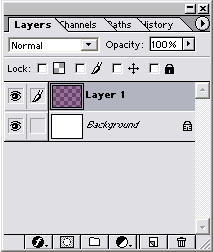
Layers work like sheets of acetate- you know, what they use in animation?
The stuff you paint on to one layer wont effect another layer in the
layer tab (see left). If you paint on a layer above the one below,
you'll cover up the bottom layer BUT not paint over it. Go to the
PhotoShop Help (F1) and read the info on layers, while experimenting
on your own. Layers are a very important part of the CGing process
and you need to know how you use them and how they work.
Notes:
When you import an image into PS it'll be called Background. You
can't edit Background layer so you need to convert it to a
normal unlocked layer like Layer 1 by dragging it onto the new layer
icon (the one next to the trash can). Now that you have "Layer
1", rename (ALT and double click) it according to what you'll
add to it. I use dozens of layers and naming then can be a lot quicker
in the long run rather than going though each one trying to find the
"Blue cloth material" one.
Once you've laid your flat tone, it's ready for CGing, so lock
it. By locking that layer, it effectively creates a mask so you
can only paint on the flat and nothing else, which is the best thing
about layers! But putting different colours on different layers, you
can render each individually without adding unwanted hair colour on
to the girl's face or skin tone on the guy's jacket. I could've wrote
a 10000 word essay on layers and CGing, but PhotoShop's help files
have the same info, and practice really will make perfect!
Summary:
- I
hope this gives you an idea of the tools involved in colouring you
work with PhotoShop. There are similar programs to PhotoShop such
as PaintShop Pro, which is a great alternative if you can't get hold
of PhotoShop. Now check out the Scanning tutorial to find out exactly
how to start making use of PhotoShop's tools!
|
