Smile: Student Bank
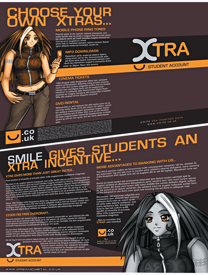
| Description: | The character art was originally created for a different client and used as a stock example image for the student bank's 4-sided leaflet. It was an excercise in Adobe InDesign layout as much as anything which used my Photoshop-made character art and Illustrator-made logo to present a cool looking layout which a student would be inclinded to pick up and flick through. |
||