Kitteh's characterToday's Observation: Seems to be a lot more talent floating around on the web these days compared to when I first got into drawing anime several years ago. I wonder if this is just ‘coz there are more talented people with access to the web or if artists are generally just getting a lot better and continually pushing the bar higher? 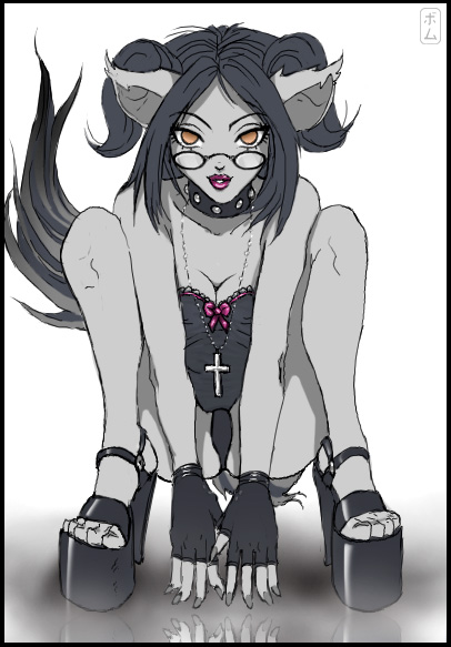 This is something I came up with for the Monthly Anime Gaijin contest (Original character design by Kitteh). I’ve submitted to the MAG in the past, but never won. I don’t expect to with this messy tablet drawing. If I had more time I might have been able to reference the pose, neatened up the line art and added more detail to the colours. Maybe next time?
|
Honey does some spring cleaningRemoved from the main Fanart Gallery for various reasons, this was my 2nd submission to "H Amok" (an erotic themed anime art contest), whereby "spring cleaning" was this month's theme. Since Honey (Game Character from Fighting Vipers) already wears a maid-type outfit, I felt I'd go one better and show her on the floor with a feather duster in hand! Had to work hard to get this in on time, but it turned out well I think 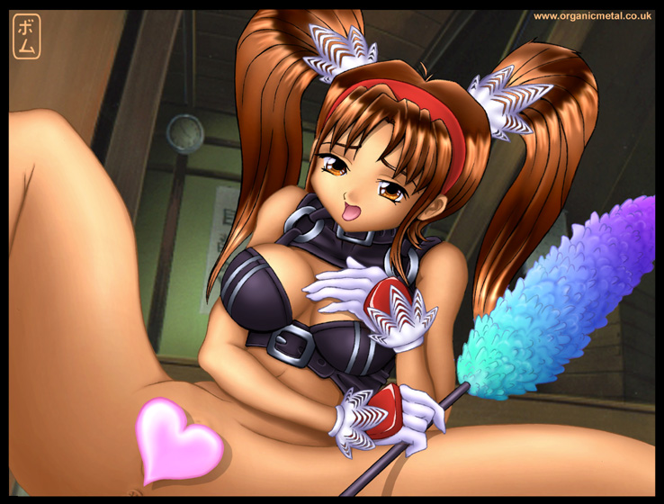 Alternative "Night time" colours can be seen by clicking here.
|
Image of SelfMSN buddy Rik was creating an anime style portrait of himself, so I thought I'd have a crack it too ^o^  Not quite right :s  Trying an anime SD version! Although they were just quick tablet doodles, I wonder if there's a way to make a lines look a little smoother and less wobbly without drawing them quicker? To check out some of my previous doodles and speed paints (as well as other people's stuff) look in this forum Thread.
|
First entry in Organi Metal's 'New' Blog, hopefully not the last ^_^ [Entries prior to this are old, relegated artworks]
|
Jotaro & Star Platinum (JoJo's Bizarre Adventure)It's been ages since I actually did some artwork that was for fun. I've been meaning to create some JoJo fan art for ages, so I'm glad I finally got around to it. There are so many more fan arts I want to work on! 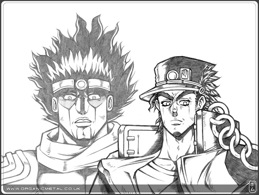 Drawn in Pencil I also created a coloured version, although I don't prefer it compared to the pencil one to be honest. I hadn't worked on any digital airbrush rendering since Oct '03. And coupled with the fact, it only took an evening to colour, It didn't turn out too good. For a fairly quick piece of fan art, I suppose it's not too bad. I just need to put more effort in next time. 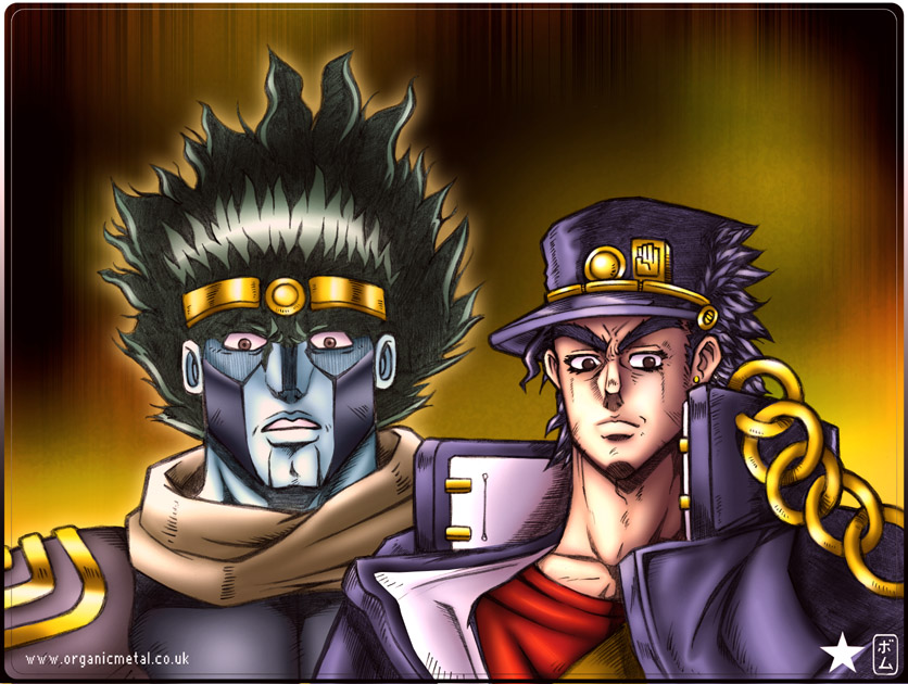 Pencil & Photoshop 7 JoJo's Bizarre Adventure, for those that don't know, is a manga and animated series. After watching the anime I was hooked and wish I knew better Japanese so I could read the Manga, which hasn't been translated into English -at the time of this entry at least. Series 3 of the manga, which the anime is based in is about a guy named Jotaro who has the power to summon a guardian spirit call a 'stand' to help battle enemies. He joins up with a team of allies who are searching for the evil stand user, Dio. To put an end to his world conquest and bad-doings. The fighting in JoJo is very tactical- each user's stands are very unique and sometimes a little weird, but it's these unconventional aspects which make it such a kick-ass series.
|
Heely: Character DesignI came up with a story idea involving this boy. It's a story that will most likely never see the light of day, but I'm enjoying designing characters for it. I'm calling him 'Heely' for now. He looks a little more cartoony than I'd usually draw, but thought keeping it simple would be a good idea if I needed to redraw him multiple times. I intended to ink him using Adobe Illustrator (would be my first time vector line art!), but after about an hour's practice, I couldn't get the hang of it, so thought I’d be better off just inking the traditional way. Maybe I'll give Illustrator another go later? 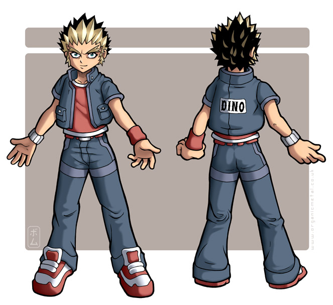 Pencil, Ink & Photoshop 7
|
RagwortIn 2002 I began to work on a website design for Ridge Meadow Nursery. Unfortunately, due to lack of funding the site wasn't completed. A shame since I had plans to make it best nursery school site in the UK or even rest of the world! At least I managed to salvage the site's mascot character, Ragwort! A meadow bunny holding a 'ragwort' meadow flower. His job was to help guide visitors though the web site with speech & subtitles upon clicking. I also designed his smaller, animated mouse-like meadow friends, which served to bring attention to particular sections on the web page.
|
City SceneA possible background piece created for an animation project. The camera will pan downwards from the moon to the street for the introduction to the scene. 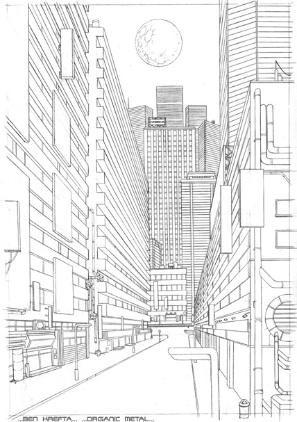 Drawn in Pencil
|
Old DesignsI did these designs years ago- the Sony one was an early Photoshop experiment and the two video covers were done for a media production company called Capricorn.  Created in 2000 and 2001 using Photoshop 5.5!
|
Fashion GirlTook days to colour - At the time it was probably the longest period I'd spent colouring. I wanted to go for a realistic CG style similar to Shinkiro- the Capcom artist that did all the characters designs for the King of Fighters games. He draws semi-realistic anime artwork (more realistic than this line art) and renders it to look more 'real' than your typical manga style CG by using photo reference material and such. I used to think some of his stuff was photographed until I saw a pic of him working from reference in Gamest Mook (a monthly Japanese game guide or artwork magazine-book). 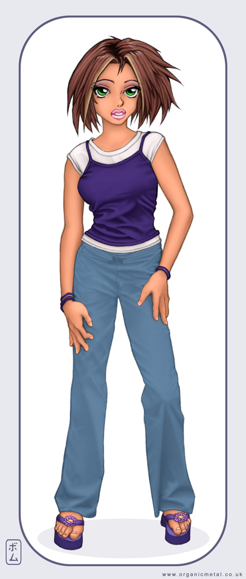 Pencil & Photoshop 5.5 Check out the Grayscale Version of Fashion Girl
|